JB Construction
— Brand Identity and Print Design, LAKEWOOD NSW
Jarryd Bird had been working in the trades for years before he decided to go out on his own. By the time he handed in his notice, he already had a full book. His reputation had done the work before he even had a business name.
What he didn't have was anything to hand someone when they asked. No logo. No card. No visual identity of any kind. Just a name, a phone number, and twelve months of work already lined up.
He needed a brand that could keep up with the business he'd already built — something confident enough to match the quality of his work and simple enough to never get in the way of it.
THE CHALLENGE
JB Construction is not a business that needs to shout. Jarryd's clients find him through word of mouth, stay with him, and send their friends. The brand didn't need to convince anyone of anything — it needed to confirm what people already believed about him before they'd even seen a single piece of work.
That's a specific design problem. The logo and card had to communicate craftsmanship, reliability, and attention to detail in a single glance — without the kind of decorative flourish that would feel wrong for a tradie who turns up on time, does exceptional work, and leaves the site cleaner than he found it.
Bold. Unfussy. Built to last.
WHAT WE BUILT
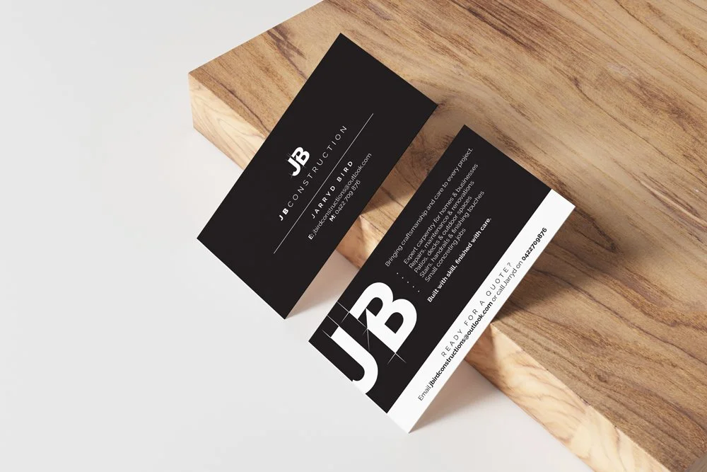
A complete brand identity built from scratch — logo, colour system, and business card design, front and back.
The JB monogram is the centrepiece. Strong and confident at small scale, bold and graphic at large scale. It works on a business card in someone's wallet and on the side of a ute with equal conviction. The combination of a refined serif-adjacent mark with clean sans-serif typesetting gives it a feeling of trade competence without being generic — it reads like someone who takes their work seriously, which is exactly what Jarryd does.
Black and white was the deliberate choice. No colour, no softening, no compromise. The palette communicates the same thing the work does: precise, considered, no shortcuts.
The business card does the job of a website — it tells you exactly who Jarryd is, what he does, and how to reach him, with enough personality that you keep it rather than throwing it in a drawer. The back leads with the oversized JB mark so it's immediately recognisable as his, even face down on a workbench.
Jarryd doesn't have a website and doesn't need one. The card is doing all the work. That, in itself, says something about the quality of what he's built.
THE RESULT
A brand identity that matches the business Jarryd had already built before he technically started. Something he can hand over with confidence, that represents the quality of his work before anyone's seen a single project, and that will still look right in ten years when JB Construction is twice the size it is now.
He was booked out before the cards were printed. That hasn't changed.
Deliverables: Logo design and brand identity · Business card design (front and back) · Print-ready files